Button
The button is used to create a button that contains a text label over a coloured background. A basic button can be easily created by using only these properties. However, a more complex button can be created by exploring some additional properties of the Button. To create a button:
A button will appear in the displayed Lesson Screen and the Button dialog will be displayed with the General tab active. |
|||
Dialog controls |
See The Interaction Toolbar for information about the dialog controls displayed at the bottom of the dialog box.
|
||
|
|||
Name |
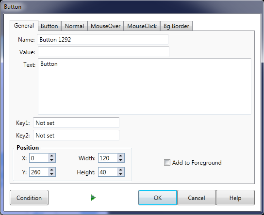
This is the name of the button interaction (that will be displayed in the Interaction list of the Element dialog). |
||
Value |
The Value field is used to identify which button the user clicked when running the Lesson - see The Interaction Toolbar for more information. The value is tested within the Response section of the Element - see 2nd Dropdown list of The Conditions tab for more information. |
||
Text |
Type the text you wish to appear on the button directly into the Text field. The button will update on the Lesson Screen as you type. |
||
Key1 and Key2 |
The Key1 and Key2 text box allows you to define a key that, when pressed by the user, will be the equivalent of the user clicking the button. To do so, click the text box, then press the key or key combination on your keyboard that you wish to define. The key will then appear in the text box. To get rid of a key you have defined, click the cut button next to the key. |
||
Position |
Set the upper left corner position of the button with x and y as well as the height and width. |
||
Add to Foreground |
You can make the button persistent by adding it to the Foreground of the Lesson (tick the Add to Foreground check box). This will mean that the button will continue to appear on subsequent Elements. |
||
Button tab |
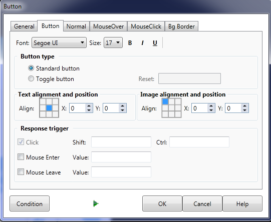
The Button tab on the Button dialog allows you to control the appearance and position of the button text and the button type. In the button tab you set:
An important property on the Button tab is the Button type . The types of button available are Standard and Toggle. The drop down list allows you to define in what order the images contained within the button are displayed as the user presses and releases the mouse. The images themselves are added on the Image tab of the dialog. Text position sets where the text appears in relation to the button. Response trigger sets how the trainee interacts with the button. By default it is set to Click. This means the answer will be set to the value set in the General tab. If click is not selected click will have no effect. Shift and Ctrl allow values to be sent to the Response for holding down Ctrl or Shift while clicking a button Mouse Enter triggers a respose when the mouse is moved over the button. The value box next to it sets the value for mouse over, if the value box is blank the value set in general tab will be used. Having a separate value for Mouse Enter to click means you can trigger different reponses for each. Mouse Leave triggers a response when the mouse moves away from the button. Mouse leave can have its own value or use the same value set in the general tab. |
||
Normal tab |
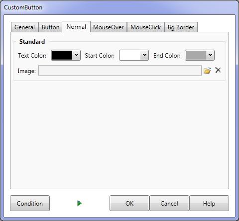
The Normal tab is used to change the colors used on a button when it's in its normal state (not being clicked on and no mouse over). Text Color sets color of the text on the button. Start Color sets the first color of a gradient. End Color set the second colour of a gradient. Image allows you to use an image as a background for your button instead of using a plain color or gradient.
|
||
Mouse Over tab |
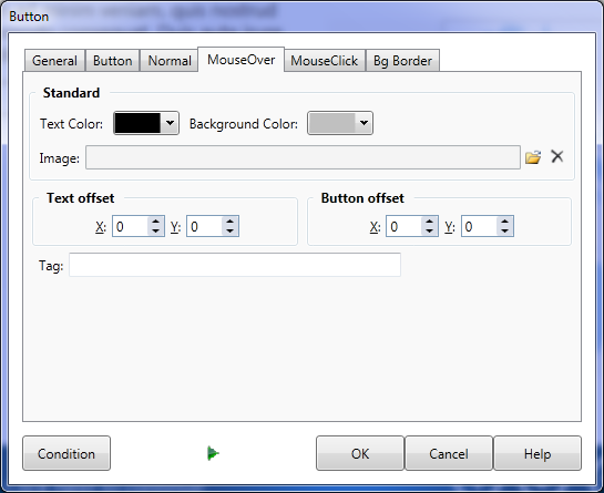
The Mouse Over tab allows you to define properties that affect the appearance of the button when the user moves the cursor over the button. The color and image properties are the same as in the normal tab. Text offset changes the position of the text on the button. For example if you set it X to 1 and Y to 1 the text will be lower and to the right when the cursor is over the button.
|
||
Offset |
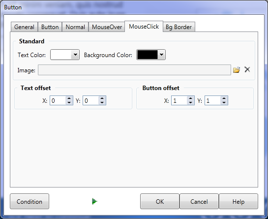
The button and its text can be offset by setting X: and Y: values for each. These measurements are in pixels. |
||
Mouse click tab |
The Mouse click tab is used to change the appearance of the button after it has been clicked by the user. You can achieve an "up" and "down" effect for the button by entering values into the Text offset and Button Offset fields. You can also choose to play a sound when the button is clicked. Button offset changes the position of the whole button. If you set X to 2 and Y to 2 for both text and button offset it will appear similar to a real button being pressed. |
||
Bg Border tab |
|
||
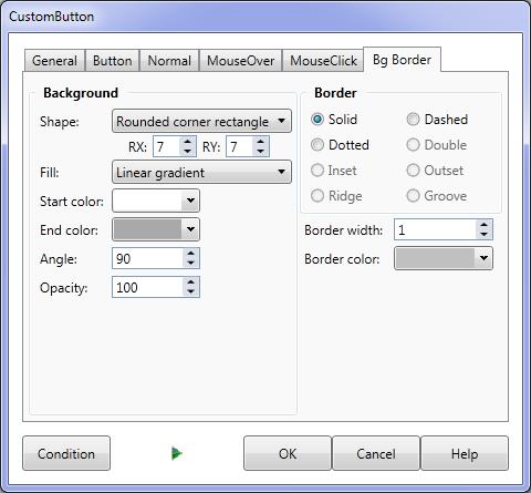
BG Border tab |
The Bg Border tab sets appearance properties that affect the appearance of the buttons in all three states. See Background and Border tab for more information.
|
||
Examples of Custom Buttons |
See Response EXAMPLES for more information. |
||

