Foreground Navigation Buttons
|
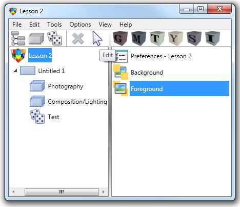
To add a Navigation button from the Lesson dialog:
|
||
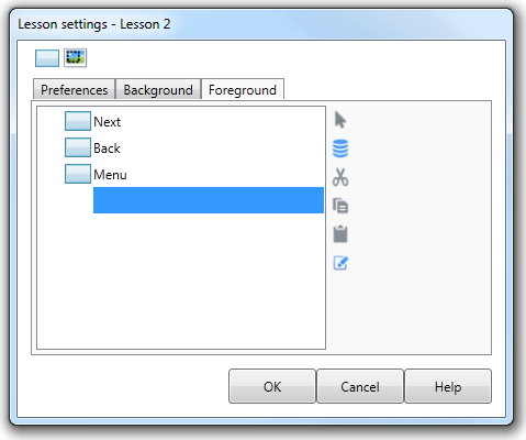
The Lesson settings dialog box is displayed with the Foreground tab active. This dialog contains an Interaction list. |
|||
|
|||
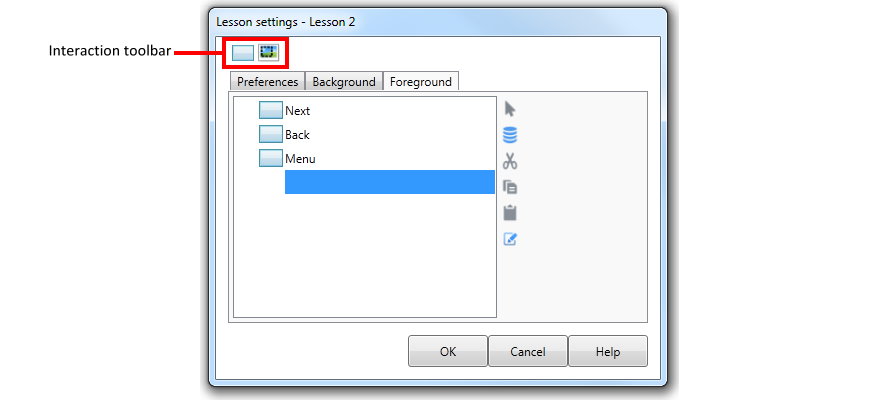
Any buttons you add will be displayed in this list. At the top of the Lesson settings dialog box is an Interaction toolbar which contains the various types of buttons that you can add to the Lesson Foreground.
A Navigation button can be any one of the buttons on the Interaction toolbar. |
|||
|
|||
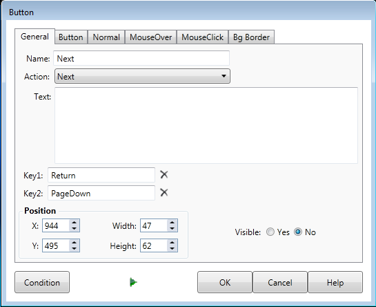
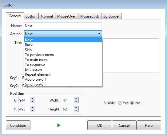
A button will then be displayed directly on the Lesson Screen in the top left corner. The Button dialog will also appear allowing you to edit the properties of the button. The General tab is active by default. The button can be re-positioned either by dragging the button to a new location or by directly editing the Position coordinates in the button dialog. |
|||
|
|||
The Action drop down will then contain the various types of Navigation button that you can define. (This list will change to a text field called Value for non-naviagation buttons.) |
|||
Button
|
When you choose an item from the Action drop down you are defining the response of the button when it is clicked by the user. The choices for Action property limit the behaviour of the button when clicked. The button itself can have the text and appearance of your choosing.
|
||
|
|||
Next |
A Navigation button set to Next allows the user to continue the Lesson forwards. Next buttons may be used to end pauses or move from the Interaction section to the Response Section. |
||
Back |
A Navigation button set to Back allows the user to navigate backwards through the Lesson. This movement will be Element by Element. |
||
Skip |
A Skip button will allow the user to skip the Response section of the current Element and have the Lesson move to the start of the following Element. |
||
To previous
|
If the user clicks on a Navigation button set to To previous menu the Lesson will move to the Introduction section of the Menu to which the current option is attached. |
||
To main |
If the user clicks on a Navigation button set to To main menu the Lesson will move to the Introduction section of the Top Level Menu defined for the Lesson. |
||
To Response |
If the user clicks on a Navigation button set to To Response the Lesson will move to the Response section of the Element. |
||
Exit lesson |
This type of navigation button will exit the Lesson and return the user to the Windows desktop when clicked. |
||
Repeat element |
This is used to repeat the element from the start. |
||
Allows the user to turn off audio (not really recommended as for most AUTHOR™ lessons voice-over is required). |
|||
Synch on/off |
This button disables synch so pauses are ignored. All actions will be displayed at once instead of in synch with the audio if the user clicks this button. |
||
The remaining tabs on the Button Dialog allow you to alter other properties that affect the general appearance of the button. See The Interaction Toolbar - Custom button for more information. |
|||
